Revising my Predictive Metrics
June 30, 2021… that was when I last published an article on this website that I founded three winters ago. Up until now, I had not felt the urge to write anything about baseball. I’ve been busy completing my schoolwork (I’m a freshman at Michigan) and up until a few days ago, busy watching college basketball. The baseball lockout certainly played a role in my lack of desire to write on the sport. To my pleasant surprise, on March 12, a deal was reached, Opening Day to take place in early April and 162 games to be played. As a result, I became determined to revise my predictive metrics, hopefully for the better, before the commencement of the season. It took a ton of time, but I did accomplish my goal.
First, I loaded all pitches thrown since 2008 into RStudio using Bill Petti’s baseballr package, which took forever. Subsequently, I made some tweaks to the datasets in certain cases where the count featured four balls or three strikes, also removing pitches thrown in plate appearances ending in bunts and bunt attempts, intentional balls, and pitchouts. Then, I decided what variables to try out in my linear models. I based my selections off of the components of the previous models, adding in numerous others, denoted in bold. Heart, shadow, chase, and waste refer to attack regions.

- pBB%+ Batter
- Strike percent
- Contact percent
- Heart percent
- Shadow percent
- Chase percent
- Waste percent
- Heart swing percent
- Shadow swing percent
- Chase swing percent
- Waste swing percent
- Walk percent
- pwOBAcon+ Batter
- 10th percentile exit velocity
- 20th percentile exit velocity
- 30th percentile exit velocity
- 40th percentile exit velocity
- 50th percentile exit veloicty
- 60th percentile exit velocity
- 70th percentile exit velocity
- 80th percentile exit velocity
- 90th percentile exit velocity
- Launch angle standard deviation
- Weak percent
- Topped percent
- Under percent
- Flare/burner percent
- Solid contact percent
- Barrel percent
- Sprint speed
- Weighted on-base average on contact
- pK%+ Pitcher
- Heart swing percent
- Shadow swing percent
- Chase swing percent
- Waste swing percent
- Heart whiff percent
- Shadow whiff percent
- Chase whiff percent
- Waste whiff percent
- 10th percentile release speed
- 20th percentile release speed
- 30th percentile release speed
- 40th percentile release speed
- 50th percentile release speed
- 60th percentile release speed
- 70th percentile release speed
- 80th percentile release speed
- 90th percentile release speed
- Strikeout percent
- pBB%+ Pitcher
- Strike percent
- Swing percent with pitcher behind in count
- Swing percent in even count
- Swing percent with pitcher ahead in count
- Weighted on-base average on contact denominator divided by pitches
- Walk percent
- pwOBAcon+ Pitcher
- Hard hit percent
- Flare/burner percent
- Under percent
I divided each of these by league average, multiplied by 100, and regressed them to the mean.
In the old predictive models, I had arbitrarily set a minimum plate appearances/total batters faced requirement at 300 and 250, respectively. This go around, I thought it might be insightful to compare the correlations of various linear models where the minimum requirements were set differently. I experimented with four different ones:
- 0- included all consecutive player-seasons where the minimum denominator for all pertinent variables is at least one
- 25- included all consecutive player-seasons where the minimum denominator for all pertinent variables is at least equal to the first quartile
- 50- included all consecutive player-seasons where the minimum denominator for all pertinent variables is at least equal to the second quartile
- 75- included all consecutive player-seasons where the minimum denominator for all pertinent variables is at least equal to the third quartile
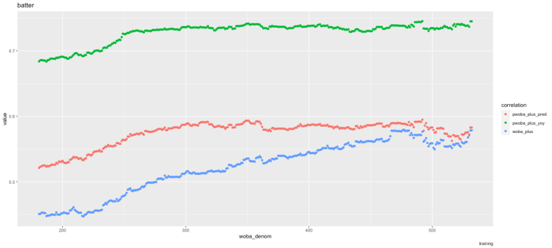
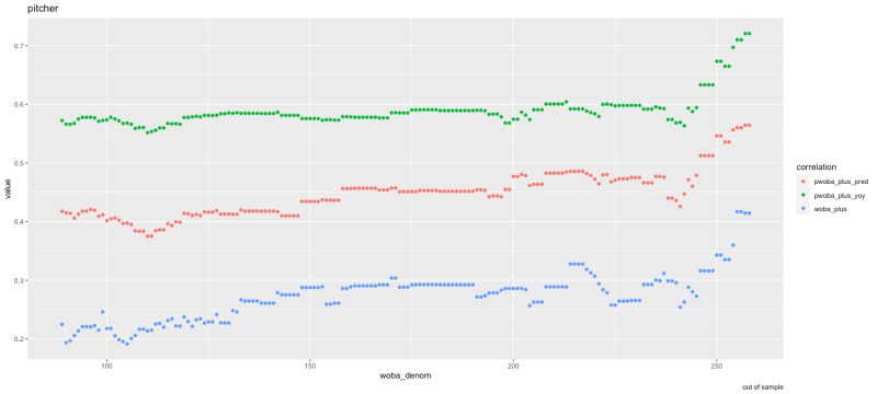
In the fourteen graphs below, the pred(iction) correlations represent a relationship between the predictive metric in year one to actual performance in year two, and the yoy (year-over-year) correlations represent a relationship between the predictive metric in year one to the predictive metric in year two. The closer the correlation is to one, the stronger it is. The training for the pBB%+ and pK%+ models were consecutive player-seasons from 2008 to 2020, out-of-sample being 2020 to 2021. The training for the other models were consecutive player-seasons from 2015 to 2020, and the out-of-sample was the same. Ideally, I’d be able to test my predictive metrics on a greater quantity of data, but I felt it was more important to feed as much information to the models as possible, thus making it more difficult to overfit them.


All in all, it appears like models three (50) and four (75) did the best. Ultimately, I opted to give the nod to to the second quartile model because I would prefer that the model is created off of more observations.
For the models, all the variables are, once again, in the form of plus stats and regressed to the mean. I only included inputs when they were statistically significant at the 0.05 level. I included some polynomial terms, but I am not going to specify them for the sake of space and confidentiality.
The first model I completed was predictive walk percent plus for batters. The final variables were…
- Strike percent
- Contact percent
- Waste percent
- Shadow swing percent
- Chase swing percent
- Walk percent
Here is how pBB%+ performed in training and out of sample…


Here is how the new pBB%+ compares to the old one…


Something to consider when stacking the two up against one another is that the old model was trained on consecutive seasons from 2015 to 2019, and that is what the training consists of in the first graph comparing the two, so that may give old pBB%+ an advantage. This applies to pitcher pBB%+ and pK%+ as well.
Here are the top single-season pBB%+ marks…
- 2015 Joey Votto (227)
- 2021 Yasmandi Grandal (213)
- 2021Juan Soto (204)
- 2008 Jack Cust (198)
- 2016 Matt Joyce (197)
- 2014 Carlos Santana (194)
- 2008 Adam Dunn (193)
- 2015 Bryce Harper (193)
- 2021 Joey Gallo (193)
- 2013 Joey Votto (191)
The second model was predictive weighted on-base average on contact plus for batters. The final variables were…
- 30th percentile exit velocity
- 50th percentile exit velocity
- 80th percentile exit velocity
- 90th percentile exit velocity
- Launch angle standard deviation
- Topped percent
- Flare/burner percent
- Barrel percent
- Sprint speed
- Weighted on-base average on contact
Here is how pwOBAcon+ performed in training and out of sample…


Here is how the new pwOBAcon+ compares to the old one…


Here are the top single-season pwOBAcon+ marks…
- 2017 Aaron Judge (149)
- 2015 Mike Trout (137)
- 2017 Joey Gallo (136)
- 2015 Giancarlo Stanton (135)
- 2018 Giancarlo Stanton (133)
- 2021 Fernando Tatis Jr. (133)
- 2017 J.D. Martinez (132)
- 2018 Mike Trout (132)
- 2015 J.D. Martinez (131)
- 2018 Joey Gallo (131)
To arrive at predictive weighted on-base average plus, initially it is necessary that I divide strikeout percent plus regressed by 100 and multiply by the league average strikeout percent, divide predictive walk percent plus regressed by 100 and multiply by the league average walk percent, divide hit-by-pitch percent plus regressed by 100 and multiply by the league average hit-by-pitch percent, and divide predictive weighted on-base average on contact plus by 100 and multiply by the league average weighted on-base average on contact. At this point, I can compute pwOBA fairly easily.
pwOBA = HBP% regressed * wHBP + pBB% * wBB + pwOBAcon * (1 – K% regressed – pBB% – HBP% regressed)
I can convert pwOBA to its plus form by dividing by the league average weighted on-base average and multiplying by 100.
Here is how pwOBA+ performed in training and out of sample…

Here is how the new pwOBA+ compares to the old one…


Here are the top single-season pwOBA+ marks…
- 2019 Mike Trout (133)
- 2018 Mike Trout (132)
- 2021 Vladimir Guerrero Jr. (129)
- 2015 Mike Trout (128)
- 2015 Bryce Harper (128)
- 2017 Aaron Judge (128)
- 2016 Mike Trout (127)
- 2017 Mike Trout (127)
- 2015 José Bautista (125)
- 2021 Juan Soto (124)
The third model was predictive strikeout percent plus for pitchers. The final variables were…
- Shadow swing percent
- Waste swing percent
- Heart whiff percent
- 50th percentile release speed
- 90th percentile release speed
- Strikeout percent
Here is how pK%+ performed in training and out of sample…


Here is how the new pK%+ compares to the old one…


Here are the top single-season pK%+ marks…
- 2014 Aroldis Chapman (201)
- 2021 Craig Kimbrel (195)
- 2012 Craig Kimbrel (189)
- 2011 Craig Kimbrel (188)
- 2012 Aroldis Chapman (175)
- 2015 Aroldis Chapman (175)
- 2010 Carlos Marmol (174)
- 2013 Aroldis Chapman (174)
- 2016 Dellin Betances (168)
- 2017 Craig Kimbrel (167)
The fourth model was predictive walk percent plus for pitchers. The final variables were…
- Strike percent
- Swing percent with pitcher ahead in count
- Weighted on-base average on contact denominator divided by pitches
- Walk percent
Here is how pBB%+ performed in training and out of sample…


Here is how the new pBB%+ compares to the old one…


Here are the top single-season pBB%+ marks…
- 2010 Cliff Lee (23)
- 2014 Phil Hughes (25)
- 2015 Bartolo Colon (42)
- 2009 Roy Halladay (43)
- 2012 Cliff Lee (43)
- 2012 Bartolo Colon (46)
- 2013 Cliff Lee (46)
- 2015 Phil Hughes (46
- 2018 Miles Mikolas (46)
- 2008 Greg Maddux (47)
The fifth and final model was predictive weighted on-base average on contact plus for pitchers. The final variables were…
- Hard hit percent
- Topped percent
- Under percent
Here is how pwOBAcon+ performed in training and out of sample…


Here is how the new pwOBAcon+ compares to the old one…


Here are the top single-season pwOBAcon+ marks…
- 2016 Zack Britton (83)
- 2019 Zack Britton (86)
- 2015 Jake Arrieta (88)
- 2015 Dallas Keuchel (88)
- 2015 Brett Anderson (89)
- 2015 Zack Britton (89)
- 2016 Matt Bowman (89)
- 2017 Scott Alexander (89)
- 2018 Scott Alexander (89)
- 2021 Emmanuel Clase (89)
For pitchers,
pwOBA = HBP% regressed * wHBP + pBB% * wBB + pwOBAcon * (1 – pK% – pBB% – HBP% regressed)
The only difference between the pwOBA calculation for batters and pitchers is that pK% takes the place of K% regressed in regard to pitchers.
Here is how pwOBA+ performed in training and out of sample…

Here is how the new pwOBA+ compares to the old one…


Here is how the pwOBA+ compares to ERA, SIERA, and xFIP in looking at 2020 to 2021…

Here are the top single-season pwOBA+ marks…
- 2021 Craig Kimbrel (78)
- 2021 Emmanuel Clase (79)
- 2015 Clayton Kershaw (81)
- 2016 Aroldis Chapman (82)
- 2016 Andrew Miller (83)
- 2016 Zack Britton (83)
- 2018 Chris Sale (83)
- 2021 Jacob deGrom (83)
- 2015 Zack Britton (84)
- 2016 Dellin Betances (84)
Overall, I’m pleased that all of the predictive stats appear to be better at predicting corresponding actual performance the following season and more stable year-to-year than the actual counterparts. With that said, I’m a little bummed that it doesn’t necessarily appear that the new predictive metrics are more robust than the old ones are. Then again, the out-of-sample test was only on 2020 to 2021.
During the season, I intend to update the Max’s Sporting Studio Leaderboards application, which you can read more about in this primer, virtually every day. To learn how to purchase access to the app, click here.
In terms of the actual metrics themselves, I plan to update them after the 2023 season. I will make sure to allow for the out of sample testing to be two sets of consecutive seasons (2021 to 2022 and 2022 and 2023) and will tinker with adjusting for things like park effects and quality of competition. Enjoy Opening Day!
Featured image- Baseball Savant


How did you find the 30th, 50th, 80th, and 90th percentile EV? And what is regressed K% and HBP%?
I found the EV percentiles by using the quantile function in R. It sorts the data and finds the desired quantile. Regressed K% and regressed HBP% move a player’s K% and HBP% closer to league average based on how stable the stats are from one season to the next and on wOBA denominator, basically plate appearances. A player’s regressed K% or HBP% is going to be very close to league average if they have only one plate appearance.